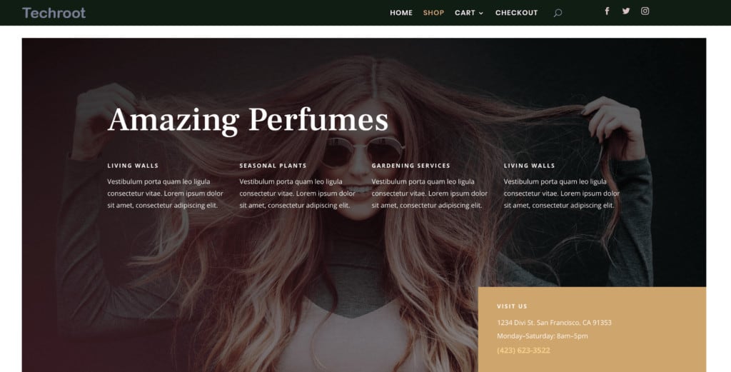
In this Divi 4.0 Theme Builder tutorial, I am going to show you how to design a Divi header, make it sticky and also make it look awesome on mobile devices.
Here is the code to make the header sticky
position: fixed;
top: 0;
left: 0;
right: 0;
Here is the code to make the menu modules stay in line.
display: flex;
Thank you – excellent tutorial and so clear.
Mak, thank you! An excellent video and tutorial, one of the best! I found the header code to make it sticky put my header too far up and the menu items disappeared. I left out the “top” setting and used:
position: fixed;
left: 0;
right: 0;
This worked perfectly!
Excellent 🙂
Hi Mak,
Thank you for yours precious tips!
But I have a problem. If I use the Theme Builder to make a global header as you said, the pages goes back the header, not like the regular header set up in the Theme customizer.
How to fix that?
Tks
Hello, Tks. Yes, the header that you build using the theme builder will overite the standard one.
Maybe I didn’t explain so well.
The header is overwriting the page itself. The top content from the page is hided behind the header.
Can you help?
Tks
I just can solve adding a top margin to each page…
It will be very boring in a large website.
Tks
But it causes a big problem because I need to set a top margin to each page and for each device too…
Kkkk! Hope you teach me to fix.
Tks
I have the same problem with this solution. It is very easy to solve at posts, because I can use a top margin at the theme builder custom body section and using a post content, but there is no solution at pages, because there is no page content modul in Divi.
Useful like always, Mak. Thanks for shear it.
You’re welcome 🙂
Mak do you have a code to shrink the menu when scrolling ? Also what about making the logo overlap the menu border ? great good thank you
Hey Mak, great fresh tutorial on this powerful update! I’ll be looking for more coming in the near future. Do you have css code to have your mega-menu dropdown be fullscreen by chance? Thanks in advance
Hi Mak,
Thanks for the wonderful article on creating a sticky global header using the new Divi 4.0. Interesting that we need to use CSS code to make the header “sticky.” I would have thought Elegant Themes would have added this capability as a “core” feature. Oh well…at least you showed us how to do it.
Thanks again!
Hi Mak,
Good video, thanks. But how do you change the width of a column once a preformatted option has been chosen?
eg. I have three equal sections. Left = Site Icon, middle = menu, right = social. Now if I wanted to increase the size of column 2 (menu) to the right, into column three. Thereby making column two wider and column three narrower. How is this done?
I’ve tried hovering the mouse over every single pixel it feels like, but all I can get is the plus symbol, to add another column.
Any advice?
Thanks once again.
Mike
thanks mak
You’re welcome 🙂
So none of those worked for me I , this did:
1 create a class: main-header
2 class-ID : et-fixed-header
3 save
4 theme options custom css box
@media only screen and (min-width: 981px) {
#main-header.et-fixed-header {
position: fixed;
padding-top:30px;
}
#page-container {
padding-top:135px;
}
}
position: fixed;
top: 0;
left: 0;
right: 0;
This code for stiky header make my header disappear.
Also this one
position: fixed;
left: 0;
right: 0;
Rene,
You probably forgot to set the z-index to 999 as Maka explained in the video. In that case no header is displayed.
when user type in the search bar text text will be black what should i do
You can customize the colors in the theme builder settings of the module.